Sattui’s beautiful bottles mean more than just great wine!
Most of our wines feature an elegant, timeless design – an off-white or black label adorned with the V. Sattui logo, often enhanced by gold foil or embossing for our most premium selections. A small collection of our bottles are graced with unique designs and artwork that are different from anything else we produce. They add a layer of depth and beauty to these already gorgeous selections. We believe stories make sharing wine special. The stories behind the labels of these beautiful bottles are sure to intrigue and delight anyone who takes the time to indulge in them.
PARADISO
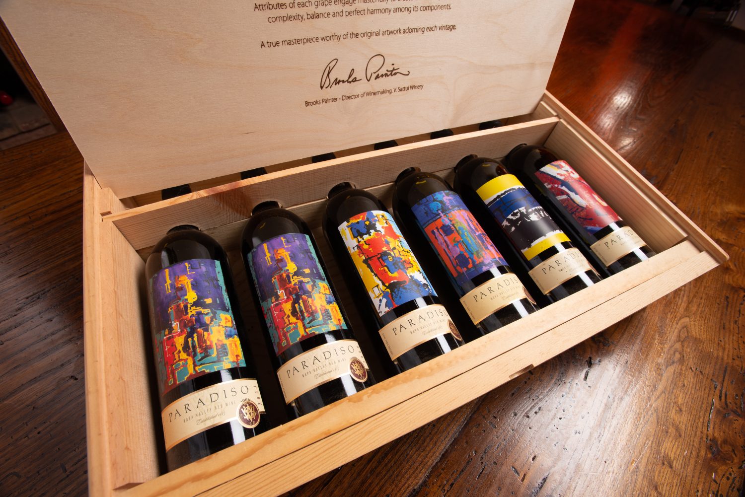
Since 2007, our Paradiso Bordeaux Blend has been graced by abstract prints from world-renowned painter, sculptor, designer, and muralist, Italian-born Fabio Sanzogni. Fabio painted the murals of our sister winery Castello di Amorosa, as well as the wall mural in our own Cellar Club, the sign on our antique truck in front of the winery, and several frescoes in Dario Sattui’s home.
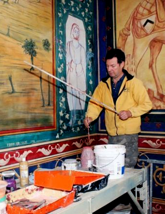 Fabio studied art in bottegas (artist workshops) building sets for theater productions. Following in the footsteps of his grandfather, he decided to pursue art. He started his own set designing company in Italy in 1987. In less than five years created sets for over 120 productions including operas, ballets, plays, musicals, and even, TV shows. In 1992, he moved to the United States and founded the Studio d’Arte in San Francisco, which is how he met Dario.
The art on our bottles was not specifically commissioned but chosen from his collection of existing works. Each vintage of Paradiso adorns a new Fabio piece as the bottle label. These labels are a favorite for our fans who love to collect them!
One person who has collected every vintage since coming of age is our own Tour Manager, Angela Ware. Her parents have been members of V. Sattui for decades, and during a tasting on her 21st birthday (in the Gold Room, no less!), she decided that her first-ever wine purchase would be the Paradiso.
Fabio also created the artwork designed specifically for our Bacci Red Blend bottle. We wanted the label to represent the smooth and easy-drinking style of the blend. The idea of “a kiss of softness” guided the design. Fabio presented us with many creative renditions – even a piece that was half man, half goat! Ultimately, the art-deco image of a couple in formal wear, gazing lovingly into each other’s eyes as though about to kiss, was the best interpretation of the tastes and textures in this succulent wine.
LA MERICA
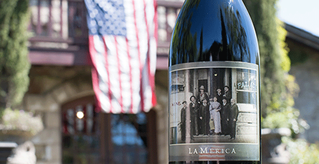 The black-and-white photograph of the Sattui family on the steps of their wine shop in San Francisco, and the pre-prohibition blend within the bottle, is a homage to the history of the Sattui family and the obstacles their business has overcome throughout its 135-year history.
Vittorio Sattui was just one of the many Italians who fled to La Merica to build better lives for themselves. He and his wife arrived in San Francisco in 1882, virtually penniless. Vittorio – originally a baker by trade – was able to open a bakery to support his family. They made wine in their home like most Italian families did back then. He soon realized that their homemade, Italian-style wine was excellent compared to what was commercially available in the Bay Area in the 1800s. Only three years later, in 1885, they quit the bakery and opened a winery in the Mission District.
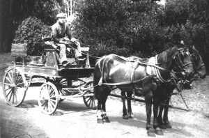 Vittorio and his sons would bring grapes from St. Helena back to San Francisco via a 2-3 day trek by ferry and horse-drawn carriage. They had to bring the grapes back to the city to produce the wine, as the finished product would not be able to survive the long journey.
In 1920, prohibition ended the family’s successful wine store. Already in his old age and adamant that they wouldn’t do anything illegal, Vittorio shuttered the business. He planned to restart it after the inevitable end of prohibition. Unfortunately, they didn’t expect the law to last for 13 years. By the time prohibition was lifted, the family had moved on to other businesses, and V. Sattui Winery remained dormant for more than fifty years until Dario Sattui opened the current St. Helena winery in 1975. We owe much of today’s success to the resilience and dedication of the generations that came before us, as the La Merica blend literally wouldn’t have been possible without them!
15 YEAR OLD PORT
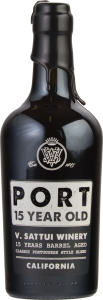 One of the most unique bottle designs on our roster belongs to the 15 Year Old Port, a tawny port aged in small oak casks for a minimum of 15 years. We work with a company called Bergin Glass for all our screen-printed bottles. Their lead designer and our personal friend, Brad Canfield, tackled the design of this package from start to finish. The 15 Year Old Port is layered and complex with a graceful texture.
With this in mind, we selected a 500mL bottle with a slightly tapered body to visually represent its refined expression. For the label, we had initially considered a black-on-black option. It would use different textures and mixture of matte and gloss finishes for the lettering and background. Ultimately, the white stamped print on the black bottle with the name reversed in style won out in the end. It’s bold tapered lettering stamped on the feminine frame of the bottle, topped with dripping black wax made for a classic look that is both eye-catching and exciting!
So why discuss our design choices? Plenty of people choose which wine to gift or serve during the holidays based on the label art. Now that you know the inspiration and stories behind the labels of some of our iconic bottle art, we hope you will choose to share our wine – and our stories – with your friends and family this year!